
Effective Landing Page Guide for Digital Marketers
An effective landing page is a conversion-focused web page designed to turn visitors into customers through targeted design, copy, and usability tactics that align with visitor intent and campaign goals. The industry term for this practice is conversion rate optimization, or CRO, and every tactic in this effective landing page guide connects directly to that discipline. Median landing page conversion rates across all sectors in 2026 range from 4.3% to 6.6%, with top performers exceeding 11.4%. That gap between median and top performance is not luck. It is the direct result of applying specific, testable techniques that most marketers skip. This guide covers every major lever: message match, design focus, form simplification, mobile experience, and continuous testing, with data from 2026 benchmarks to back each recommendation.
What is an effective landing page guide, and why does message match matter most?
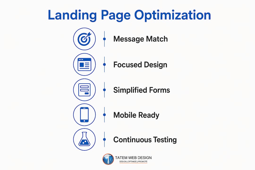
Message match is the degree of alignment between your ad copy and your landing page headline. Message match yields conversion lifts of up to 212%, making it the single highest-impact optimization step available to any marketer. That number is not a rounding error. It means a page that mirrors its traffic source can more than triple conversions without changing a single design element.
The mechanics are straightforward. A visitor clicks an ad that reads “Free SEO Audit for Florida Businesses.” If the landing page headline reads “Welcome to Our Digital Agency,” the visitor experiences a relevance gap. That gap creates doubt, and doubt kills conversions. The fix is to carry the exact language, offer, and tone from the ad directly into the headline and subheadline of the page.

Segmentation by traffic source strengthens message match further. Paid search visitors arrive with high intent and respond to direct, benefit-led headlines. Social media visitors arrive with lower intent and respond better to curiosity-driven hooks. Email list visitors already trust you and respond to personalized, exclusive-feeling offers. Each traffic source deserves its own landing page variant, not a single generic page.
The consequences of mismatch are measurable. Aligning messages alone can increase conversions by 31.4%, according to 2026 benchmark data. That means the first question to ask about any underperforming page is not “Should we change the button color?” It is “Does this page say exactly what the ad promised?”
Key practices for strong message match:
- Copy the core offer phrase from your ad directly into the H1 headline.
- Match the visual tone of the ad, including color palette and imagery style.
- Repeat the specific benefit stated in the ad within the first 100 words of the page.
- Create separate landing pages for each major traffic source or campaign.
- Audit existing pages by placing the ad and page side by side and checking for language gaps.
Pro Tip: Run a five-second test with a colleague who has not seen the ad. Show them the landing page for five seconds, then ask what offer it is promoting. If they cannot answer correctly, your message match needs work.
What are the best design practices that drive landing page conversions?
Removing navigation menus is the most underused design tactic in landing page optimization. Only 16% of landing pages currently have no navigation, yet every exit link on a page is a conversion leak. When a visitor can click to your blog, your about page, or your social profiles, you are actively competing against yourself. A focused landing page removes all of those options and leaves one path: the call to action.
Visual hierarchy and CTA placement
Your call to action should appear above the fold, meaning visible without scrolling, and then repeat at logical intervals down the page. A single CTA repeated is more effective than multiple different CTAs competing for attention. The button copy matters as much as its placement. “Get My Free Audit” outperforms “Submit” because it restates the value the visitor receives.
Trust signals scored above 78% in importance in a 2025 study of conversion factors. That finding means social proof is not a nice addition. It is a structural requirement. Place client logos or certifications at the top of the page for immediate credibility. Place guarantees and security badges directly adjacent to your CTA to reduce anxiety at the moment of decision.
Research on webpage prototypicality and user trust shows that visitors evaluate pages subconsciously against industry design conventions. A legal services page that looks like a tech startup creates cognitive friction. A healthcare page that uses aggressive red CTAs triggers unease. Matching your design to what visitors expect from your industry reduces that friction and increases trust before a single word is read.
Load speed is a design decision, not a technical afterthought. Pages that load in under three seconds convert at double the rate of slower pages. Every unnecessary image, script, or font file is a conversion tax. Compress images, minimize JavaScript, and use a content delivery network for any page you are driving paid traffic to.
Best design practices at a glance:
- Remove all navigation menus and unrelated outbound links.
- Place the primary CTA above the fold and repeat it every 300–400 words of scroll.
- Layer trust signals: brand logos and certifications at the top, guarantees near the CTA.
- Match your design conventions to your industry’s visual expectations.
- Target a load time under three seconds, especially for mobile visitors.
- Use directional cues such as arrows or human eye gaze to point toward the CTA.
Pro Tip: Use Google PageSpeed Insights to score your landing page before launching any paid campaign. A score below 70 on mobile is a conversion problem, not just a technical one.
How do you optimize landing page forms to increase leads?
Form length is the most direct lever for controlling conversion rates on lead generation pages. Reducing form fields from 11 to 4 can yield up to a 120% boost in conversion rates, with each unnecessary extra field lowering conversions by 4–8%. That means a form with seven fields instead of three could be costing you more than 20% of your potential leads before a visitor even reads your headline.
The optimal field count varies by offer type and industry. B2B lead generation pages perform best with 3–4 fields. Ecommerce checkout flows perform best with 1–2 fields. The rule is to ask only for what you need to take the next step, not everything you wish you knew about the prospect.
Multi-step forms solve the tension between data needs and conversion friction. Instead of presenting eight fields at once, a multi-step form shows two or three fields per screen. The first screen asks easy, low-commitment questions like “What is your industry?” The later screens ask for contact details after the visitor has already invested effort. Completion rates rise because the psychological cost of abandoning a partially completed form is higher than never starting one.
| Form type | Optimal fields | Best for |
|---|---|---|
| B2B lead generation | 3–4 fields | Consulting, SaaS, professional services |
| Ecommerce checkout | 1–2 fields | Product purchases, free trials |
| Event registration | 2–3 fields | Webinars, local events, workshops |
| Multi-step form | 2–3 per step | Complex offers, high-value leads |
Conditional logic takes form optimization further. A field that only appears when a previous answer triggers it keeps the form visually simple while collecting richer data. A visitor who selects “Healthcare” as their industry sees a follow-up field about practice size. A visitor who selects “Retail” sees a field about store count. Both visitors see a short, relevant form rather than a long generic one.
Mobile form design requires its own attention. Use large tap targets for all input fields. Set the correct keyboard type for each field, numeric for phone numbers, email for email addresses. Autofill compatibility cuts completion time significantly. Any form that requires pinching or zooming on a phone is losing mobile conversions before the visitor even tries.
How can you optimize landing pages for mobile users and run effective tests?
Mobile accounts for 60–70% of landing page visits but consistently converts lower than desktop. That gap is not inevitable. It is the result of pages designed on desktop and then adapted for mobile as an afterthought. The correct approach is to design for mobile first and then scale up to desktop.
The most impactful mobile tactics are:
- Keep headlines to two lines or fewer on a 375-pixel screen.
- Place the CTA button within thumb reach, meaning in the lower center of the screen.
- Use single-column layouts to eliminate horizontal scrolling.
- Compress all images to under 100KB without visible quality loss.
- Test your form on an actual phone before launching, not just in a browser emulator.
A/B testing is the mechanism that turns good pages into great ones. Only about 17% of marketers run A/B tests on landing pages, but those who do see an average 37% lift in conversion rates. That is a significant return for a practice that requires no additional ad spend. The gains come from the same traffic, converting at a higher rate.
Test in the right order. The headline has the largest impact on conversion because it is the first thing every visitor reads. Test headline variants before testing anything else. After the headline, test form length. After form length, test CTA copy. Testing button color before testing the headline is the most common and costly testing mistake marketers make.
Pro Tip: Run each A/B test until you reach statistical significance, typically at least 100 conversions per variant. Ending a test early because one version looks like it is winning produces false conclusions and can actually lower your conversion rate over time.
Simpler copywriting at a 5th to 7th grade reading level converts up to 56% better than pages written at an 8th to 9th grade level. Plain language is not dumbing down your content. It is respecting your visitor’s time. Use the Hemingway App to check your page copy before publishing. If a sentence requires two readings to understand, rewrite it.
For Florida businesses building responsive landing pages, the mobile-first approach is especially relevant given the high share of mobile users in local search traffic. A page that loads fast and reads clearly on a phone captures leads that a slow, cluttered page loses entirely.
Key Takeaways
A landing page converts best when message match, focused design, simplified forms, mobile performance, and continuous testing work together as a system, not as isolated fixes.
| Point | Details |
|---|---|
| Message match drives the biggest gains | Aligning your ad copy with your headline can lift conversions by up to 212%. |
| Remove navigation to reduce exit points | Only 16% of landing pages eliminate navigation; doing so directly increases focus and conversions. |
| Shorter forms convert more leads | Cutting fields from 11 to 4 can boost conversion rates by up to 120%. |
| Mobile optimization is non-negotiable | Mobile drives 60–70% of visits but converts lower, making speed and usability critical. |
| Testing produces compounding returns | Marketers who A/B test see an average 37% lift in conversions from the same traffic. |
What I have learned from years of watching landing pages succeed and fail
The most common mistake I see is treating landing page optimization as a design project. Marketers spend weeks choosing fonts and colors, then launch a page with an 11-field form and a headline that does not match the ad. The design looks polished. The conversion rate is 1.2%. The problem was never the design.
The hierarchy of priorities matters more than any individual tactic. Fix message match first. Then remove distractions. Then simplify the form. Then test. Skipping to step four without completing steps one through three produces test results that are meaningless because you are optimizing a fundamentally broken page.
Aesthetics and functionality are not opposites, but functionality wins every time they conflict. A beautiful page that loads in six seconds on mobile is a beautiful page that nobody converts on. A plain page that loads in 1.8 seconds and has a clear headline will outperform it consistently. I have seen this play out across industries from legal services to ecommerce to local home services.
The businesses that build a testing culture, meaning they treat every page as a hypothesis rather than a finished product, are the ones that compound their gains over time. A 37% average lift from testing sounds abstract until you realize it applies to every campaign you run from that point forward. That is not a one-time win. It is a permanent improvement to your cost per lead.
Set realistic benchmarks before you declare a page successful or failed. A Home Services page converting at 6% is performing below the industry average of 8.5%. An ecommerce page at 3.1% is right at the median. Knowing your industry benchmark is the difference between making a smart optimization decision and chasing a number that was never realistic for your category. For a deeper look at creating effective landing pages from a professional services perspective, the principles above apply across every industry vertical.
— Matt
How Tatemweb builds landing pages that convert from day one
Building a high-converting landing page requires getting every element right simultaneously: message match, load speed, form design, mobile layout, and trust signals. Most business owners do not have the time to audit all of those variables while running their core operations.
Tatemweb’s AI website design services integrate conversion best practices directly into every page build. With over 26 years of experience serving Florida businesses across healthcare, legal, real estate, and professional services, Tatemweb builds pages that load fast, read clearly, and guide visitors toward a single action. The team applies AI-powered tools to automate SEO, content structure, and lead capture from the start. Call Tatemweb directly at 772-224-8118 to schedule a consultation and see what a purpose-built landing page can do for your business.
FAQ
What is a good landing page conversion rate in 2026?
The median landing page conversion rate in 2026 ranges from 4.3% to 6.6% across industries, with top performers exceeding 11.4%. Home Services pages average 8.5%, while ecommerce pages average 3.1%.
How many form fields should a landing page have?
B2B lead generation pages perform best with 3–4 fields, and ecommerce pages perform best with 1–2 fields. Each unnecessary field reduces conversion rates by 4–8%.
What is message match on a landing page?
Message match is the alignment between your ad copy and your landing page headline. Strong message match can increase conversions by up to 212% and is the highest-impact optimization available.
How does mobile traffic affect landing page performance?
Mobile accounts for 60–70% of landing page visits but converts lower than desktop. Pages that load in under three seconds double their conversion rate compared to slower pages.
How often should you A/B test a landing page?
Test continuously, starting with the headline, then form length, then CTA copy. Marketers who run A/B tests see an average 37% lift in conversions, and each test should run until at least 100 conversions per variant are recorded.
Recommended
Tatem Web Design
26+ YearsWeb Design & SEO Specialist · Tatem Web Design
Matt Tatem has been designing websites professionally since 1999, making Tatem Web Design one of Florida's longest-running web agencies. Based in Stuart, FL, he specializes in WordPress, local SEO, Shopify e-commerce, and cybersecurity consulting for small businesses.

Rank in ChatGPT in 90 Days With a Practitioner Led Checklist
Follow a practitioner led 90 day plan to get cited by ChatGPT: allow OAI-SearchBot, publish short answer capsules with schema, and track Bing AI Performance.

AI SEO Content Playbook: 16 GEO Signals for Agencies & Teams
A practical playbook mapping the GEO-16 signals to hands-on editorial workflows, review controls, and metrics. For agencies and in-house teams scaling AI...

Copy Ready Local Schema Markup for SMBs + Google Validation
Copy ready JSON-LD examples and Google validation steps for SMBs' local schema markup. Audit, implement, and verify each location page with confidence.