
What Is Mobile-First Design? A Guide for Web Pros

Mobile-first design is defined as the practice of designing a website or digital product for the smallest screen first, then scaling up to tablets and desktops. The approach, formalized by designer Luke Wroblewski and adopted widely after Google introduced mobile-first indexing, forces teams to decide what truly matters before adding complexity. For web designers, developers, and business owners in Florida and beyond, understanding this approach is no longer optional. Your visitors are already on mobile. The question is whether your site is ready for them.
What is mobile-first design and how does it work?
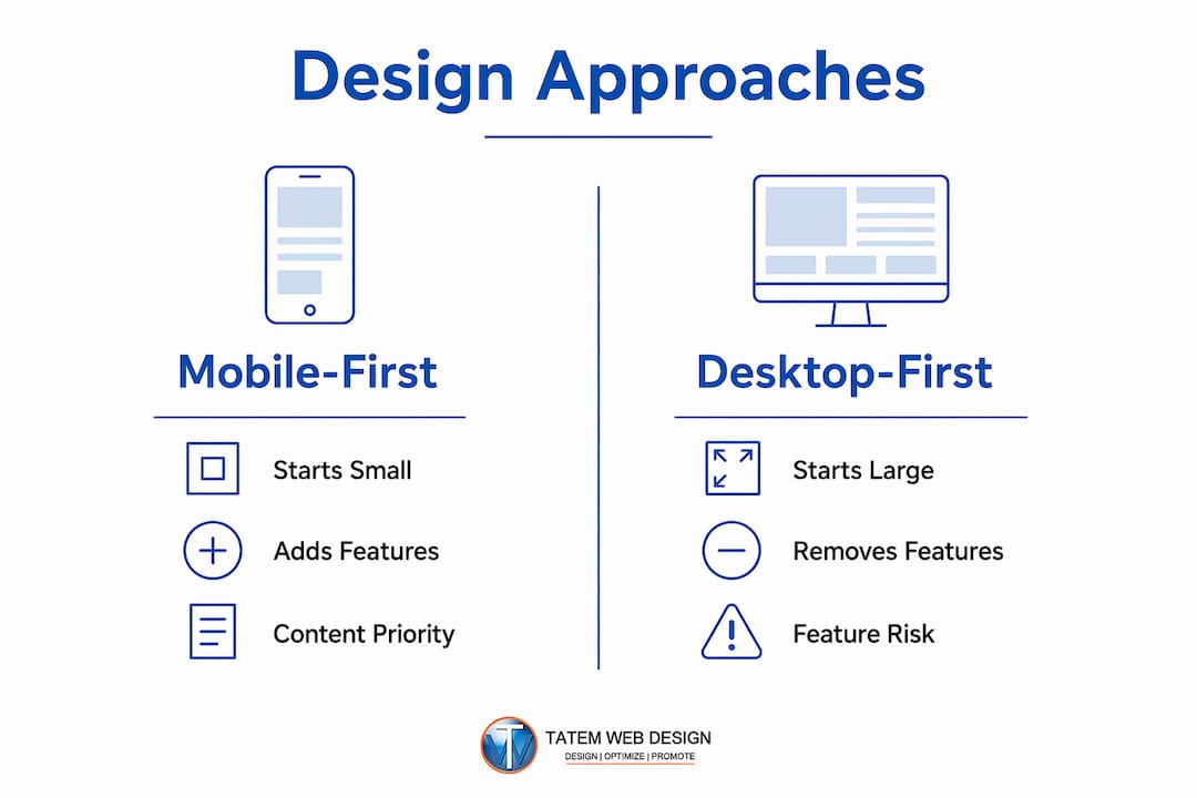
Mobile-first design starts with the smallest screen and adds features progressively as screen size increases. That progression is the key distinction. You build the core experience first, then layer on enhancements for larger devices. Nothing gets added to mobile as an afterthought.
The process begins with a mobile wireframe that contains only the content and actions a user absolutely needs. A law firm site, for example, might show a phone number, a one-sentence value statement, and a contact button. Everything else is secondary. That constraint forces clarity that desktop-first projects rarely achieve.

Google’s algorithm reinforces this discipline. Google prioritizes mobile-optimized websites in its search rankings through mobile-first indexing. That means Google crawls and evaluates your mobile version first when deciding where your site ranks. A site that looks great on a 27-inch monitor but loads slowly on an iPhone will rank lower than a leaner competitor.
Mobile-first is also accurately described as content-first design. The small screen strips away decorative elements and forces every word, image, and button to earn its place. The result is a cleaner experience on every device, not just mobile.
How does mobile-first design differ from responsive and desktop-first approaches?
Responsive design and mobile-first design are related but not the same. Responsive design means a site adapts its layout to different screen sizes using flexible grids and CSS media queries. Mobile-first is a philosophy about where you start. A responsive site can be built desktop-first or mobile-first. The starting point determines the quality of the outcome.
Desktop-first design begins with a full-featured layout and then strips elements down for smaller screens. That process creates a constant battle against bloat. Designers remove features, shrink images, and hide navigation items. The mobile experience becomes a reduced version of the desktop, not a purpose-built product.
The mobile-first approach reverses that logic. You build the minimum viable experience for mobile, then add features as screen real estate grows. The desktop version becomes an enhanced version of mobile, not a stripped-down one. That shift in direction produces better results at every screen size.
| Approach | Starting point | Scaling direction | Core risk |
|---|---|---|---|
| Desktop-first | Large screen | Scale down | Mobile experience feels stripped |
| Responsive only | Either | Adapts both ways | No clear content priority |
| Mobile-first | Small screen | Scale up | Requires strong content discipline |
| Progressive enhancement | Core functionality | Add layers up | Slower initial build process |
The table above shows why mobile-first produces the most disciplined results. Every other approach risks carrying desktop assumptions into the mobile experience. Mobile-first eliminates that risk by design.
What are the key principles and best practices of mobile-first design?
The core mobile-first principles are simplicity, performance, progressive enhancement, and a content-first mindset. Each principle builds on the others. Simplicity without performance still produces a slow site. Performance without content priority produces a fast site with nothing useful on it.
Prioritize content ruthlessly
Mobile screens force a decision: what does this user need right now? A dentist’s website needs an appointment button and a phone number above the fold. A real estate site needs a property search. Identify the one or two actions your mobile visitor will take, and design around those first. Everything else follows.
Design for performance from the start
Mobile-first sites have reduced file sizes and faster loading times, which directly improves user retention. Performance is not a final step. It is a design constraint from the first wireframe. Use compressed images, minimal JavaScript, and system fonts by default. Add visual richness only when the larger screen justifies it.
Apply progressive enhancement
Progressive enhancement means you build a fully functional experience for the smallest, least capable device first. Then you add visual complexity, animations, and additional features for devices that can handle them. CSS media queries using min-width breakpoints are the technical tool for this. You write base styles for mobile, then add rules at 768px, 1024px, and beyond.
Eliminate non-essential elements
- Remove navigation items that do not serve a primary user task
- Replace large hero images with smaller, optimized alternatives on mobile
- Collapse secondary content into accordions or tabs rather than hiding it entirely
- Use single-column layouts as the default, not the fallback
- Test tap target sizes. Buttons need a minimum touch area of 44x44 pixels per Apple’s Human Interface Guidelines
Pro Tip: Test your mobile wireframe with real users before building the desktop version. If the mobile layout confuses people, the desktop version will too. Fixing problems at the wireframe stage costs a fraction of what it costs after development.
Why should businesses and designers choose mobile-first design?
The business case for the mobile-first approach is direct. Simplified, mobile-optimized interfaces reduce user friction and increase conversions. When a visitor lands on your site from a phone and can immediately find what they need, they stay. When they have to pinch, zoom, and scroll through a desktop layout on a 6-inch screen, they leave.
The SEO benefit is equally concrete. Google’s mobile-first indexing means your mobile site is your primary site in Google’s eyes. A Florida accounting firm with a fast, clean mobile site will outrank a competitor with a slow, desktop-heavy site, even if the competitor’s desktop version looks more impressive. The responsive web design benefits compound over time as Google continues to weight mobile performance in its ranking signals.
“Mobile-first is not just a layout tactic. It is a strategic discipline that forces teams to identify the core value of a product and eliminate everything that does not serve it.” — Figr Design
The benefits extend to development efficiency as well. When your team starts with mobile, they make fewer decisions twice. Desktop enhancements are additive. Desktop-first projects require constant negotiation about what to remove, which slows every sprint and creates inconsistency across breakpoints.
Key business benefits of the mobile-first approach include:
- Higher search rankings because Google indexes the mobile version of your site first
- Faster load times because mobile-first builds enforce lean code and compressed assets from the start
- Better conversion rates because mobile-optimized navigation reduces friction for the majority of visitors
- Lower bounce rates because users find what they need without reformatting the page mentally
- Broader accessibility because clean, simple layouts work better for users with disabilities and older devices
For professional services firms in healthcare, legal, and real estate, these benefits translate directly to more phone calls, more form submissions, and more booked appointments.
How to implement mobile-first design: tools and workflow
A mobile-first workflow follows a clear sequence. Skipping steps creates the same bloat the approach is designed to prevent.
-
Define core user tasks. Before opening any design tool, write down the three actions your mobile visitor is most likely to take. For a lawyer’s site, those might be: read about practice areas, check credentials, and call the office. Every design decision flows from this list.
-
Build mobile wireframes first. Use Figma, Sketch, or Adobe XD to create low-fidelity wireframes at 375px width. This is the standard iPhone viewport. Do not design the desktop version until the mobile wireframe is approved. Workflow typically begins with mobile wireframes progressing to desktop, not the reverse.
-
Write CSS with min-width media queries. Base styles apply to all screens. Media queries at
min-width: 768pxadd tablet styles. Media queries atmin-width: 1024pxadd desktop styles. This is the technical implementation of progressive enhancement. Max-width queries work in the opposite direction and indicate a desktop-first build. -
Conduct content audits before design. Use a content-first planning tool or a simple spreadsheet to map every piece of content to a user task. If content does not support a core task, cut it or move it to a secondary page. Tatemweb’s content writing services can help you audit and rewrite content specifically for mobile-first hierarchy.
-
Test on real devices, not just browser emulators. Chrome DevTools mobile emulation is useful for quick checks, but it does not replicate real touch behavior, network conditions, or font rendering. Test on at least two physical devices before launch.
Pro Tip: Set a performance budget before development starts. Decide that your mobile page will load in under 3 seconds on a 4G connection. Then treat every asset, script, and plugin as a line item against that budget. This single constraint prevents most mobile performance problems before they start.
Common pitfalls to avoid: designing mobile as an afterthought after the desktop is complete, using max-width media queries instead of min-width, hiding mobile content with display:none instead of restructuring it, and treating mobile as a single device type rather than a range of screen sizes and connection speeds.
Key takeaways
Mobile-first design produces better websites because it forces content prioritization, improves load performance, and aligns with Google’s mobile-first indexing from the start.
| Point | Details |
|---|---|
| Start with mobile wireframes | Design at 375px first and get approval before building the desktop version. |
| Use min-width media queries | Write base CSS for mobile and add complexity at larger breakpoints progressively. |
| Prioritize core user tasks | Identify the top three actions your mobile visitor needs before any design work begins. |
| Google indexes mobile first | A fast, clean mobile site directly improves your search rankings under Google’s algorithm. |
| Mobile-first reduces bloat | Starting small forces teams to cut non-essential features before they get built. |
Why mobile-first changed how I think about web design
The most common mistake I see from teams new to mobile-first is treating it as a layout exercise. They resize the desktop design to fit a phone screen and call it done. That misses the entire point.
Mobile-first is a forcing function for product strategy. When you commit to designing for a 375px screen first, you cannot hide behind a wide layout. Every element has to justify its existence. That discipline reveals something most desktop-first projects never surface: what the product is actually for.
I have worked with professional services businesses, from accountants to healthcare providers, where the desktop site had 12 navigation items, three hero banners, and a sidebar full of widgets. None of it served the visitor’s actual goal. The mobile-first process cut that down to four navigation items and one clear call to action. Conversions went up. Bounce rates went down. The desktop version looked better too, because the thinking behind it was cleaner.
The teams that resist mobile-first usually argue that their users are on desktop. That argument is worth testing, not assuming. Even in B2B industries, a significant share of first-touch visits happen on mobile. A prospect who finds your site on their phone and has a poor experience will not come back on their laptop to give you a second chance.
Mobile-first also future-proofs your work. Wearables, foldable phones, and embedded screens are all smaller-first environments. A team that knows how to design for constraints will adapt. A team that defaults to desktop-first will keep retrofitting.
— Matt
Build your mobile-first website with Tatemweb
Tatemweb builds AI-powered websites designed mobile-first from the ground up, so your site performs where your visitors actually are. Based in Stuart, Florida, Tatemweb has over 26 years of experience creating fast, SEO-ready websites for professional services firms, healthcare providers, law firms, and e-commerce businesses across Florida.

Every Tatemweb project starts with a content and user-task audit before a single wireframe is drawn. The result is a site that loads fast, ranks well, and converts mobile visitors into real leads. Call Tatemweb directly at 772-224-8118 or visit tatemweb.com to schedule a consultation and see what a properly built mobile-first site can do for your business.
FAQ
What is mobile-first design in simple terms?
Mobile-first design means building a website for phones first, then expanding the layout for tablets and desktops. It prioritizes the content and actions most important to mobile users before adding anything else.
How is mobile-first design different from responsive design?
Responsive design describes how a site adapts to different screen sizes. Mobile-first describes where you start. A responsive site can be built desktop-first or mobile-first. Starting mobile-first produces better content prioritization and performance.
Does mobile-first design affect SEO?
Yes. Google uses mobile-first indexing, which means it crawls and ranks your mobile site version first. A fast, well-structured mobile site directly improves your position in Google search results.
What tools do designers use for mobile-first projects?
Figma, Sketch, and Adobe XD are the standard tools for mobile-first wireframing and prototyping. Developers implement mobile-first layouts using CSS with min-width media queries to scale up from mobile base styles.
Is mobile-first design right for every type of business?
Mobile-first design benefits any business whose customers use phones to search, browse, or contact them. For Florida service businesses in legal, healthcare, real estate, and retail, the mobile-first approach is the default best practice.
Recommended
Tatem Web Design
26+ YearsWeb Design & SEO Specialist · Tatem Web Design
Matt Tatem has been designing websites professionally since 1999, making Tatem Web Design one of Florida's longest-running web agencies. Based in Stuart, FL, he specializes in WordPress, local SEO, Shopify e-commerce, and cybersecurity consulting for small businesses.

What a CMMC Level 2 Assessment Requires and How to Prepare
Prepare for your CMMC Level 2 assessment by understanding requirements, assessment paths, and mapping your Controlled Unclassified Information.

A Data Retention Policy Is Your Rulebook for Keeping and Deleting Data
Establishing a clear data retention policy helps manage data risk, ensuring compliance and effective data management for your organization.

Law Firm Local SEO: A Practical Playbook for More Local Clients
Unlock more local clients for your law firm with effective local SEO strategies. Optimize your Google Business Profile and boost your visibility!