Responsive web design process: A guide for Florida SMBs

If your website looks great on a desktop but frustrates mobile visitors, you are already losing customers. The responsive web design process solves this by making your site adapt fluidly to every screen size, from a smartphone in a customer’s hand to a wide-screen monitor in an office. For Florida small and medium-sized businesses, this is not a nice-to-have feature. It is the foundation of online visibility, user engagement, and competitive performance in a market where mobile browsing dominates and Google ranks your mobile experience first.
Table of Contents
- Understanding responsive web design fundamentals
- Preparing your business for the responsive web design process
- Step-by-step execution of the responsive web design process
- Verifying and troubleshooting your responsive web design
- Why a context-first responsive web design process outperforms device-driven approaches
- Enhance your responsive web design with AI-powered solutions from Tatem Web Design
- Frequently asked questions
Key Takeaways
| Point | Details |
|---|---|
| Responsive design basics | Responsive web design uses fluid grids and media queries to adapt layouts fluidly across all device sizes. |
| Mobile-first importance | Designing for mobile first ensures your most critical content loads quickly and improves SEO under mobile-first indexing. |
| Performance matters | Optimizing images and controlling layout shifts are essential to prevent user frustration and rank higher in search results. |
| Verify on real devices | Testing your design on actual smartphones and tablets provides insights that emulator tools cannot replicate. |
| Context-first design | Designing based on user context and AI insights outperforms traditional device-based breakpoints for engagement. |
Understanding responsive web design fundamentals
Before diving into the process itself, it helps to understand what responsive web design actually is and why it works the way it does. Responsive web design is an approach that ensures web pages render well across screen sizes while maintaining usability, using fluid grids, fluid images, and CSS media queries. That definition matters because it tells you what RWD is not: it is not a single plugin, not a theme toggle, and not a mobile app. It is a design philosophy built into how your site’s code is written from the start.
The three pillars of RWD work together:
- Fluid grids: Layouts that use percentages instead of fixed pixel widths, so columns and containers resize proportionally as the viewport changes.
- Flexible images: Images that scale within their containing elements rather than overflow the screen or distort on smaller displays.
- CSS media queries: Rules that detect the viewport width (and other conditions) and apply different layout instructions accordingly.
One principle that separates good responsive design from great responsive web design best practices is where you set your breakpoints. A breakpoint is the viewport width at which your layout changes. Most beginners set breakpoints at common device widths like 768px for tablets or 375px for phones. The smarter approach is to set breakpoints where your content starts to look awkward, not where a specific device happens to land. This keeps your design future-proof because device screen sizes change constantly, but your content’s readability needs do not.
Now that you understand what responsive web design is, let’s explore what you need to prepare before starting the process.
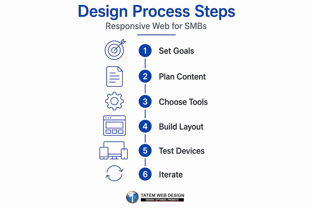
Preparing your business for the responsive web design process
Jumping straight into code without a plan is one of the most common reasons Florida businesses end up with sites that are technically responsive but practically ineffective. Preparation is where your responsive design strategy takes shape, and it starts with three concrete steps.

Define your business goals first. Are you trying to generate phone calls from local searchers? Capture leads for your real estate listings? Drive foot traffic to your Stuart, Florida storefront? Your goal determines which content must appear above the fold on mobile, which interactions need to be one-tap simple, and which pages need the fastest possible load times.
Conduct a content audit. Go through every page on your current site and ask: Does this content serve a mobile visitor? Long paragraphs, PDFs, and hover-dependent navigation menus are all friction points on mobile. Flag them for redesign before you write a single line of new CSS.
Here is what a solid pre-launch preparation checklist looks like:
- Confirm all written content is concise, scannable, and mobile-readable
- Identify pages with the highest mobile traffic in Google Analytics and prioritize them
- Audit all images for file size, since images over 200KB dramatically slow mobile load times
- Choose AI-powered design tools that can automate responsive layout adjustments and flag usability issues
- Map out your navigation structure so it works as a compact mobile menu without hiding critical links
The most important mindset shift at this stage is designing mobile-first: prioritize essential content under the constraints of screen size and speed, then progressively enhance for larger devices. This is not just a design trend. It is a practical strategy that forces you to decide what actually matters to your customers before adding extras for desktop users.
Pro Tip: Before touching any design tools, spend 10 minutes using your current website on your own smartphone. Note every tap that misses, every image that loads slowly, and every paragraph that requires zooming. That list becomes your first responsive redesign priority queue.
Choosing the right tools matters here as well. AI-driven platforms can analyze your current layouts and suggest responsive improvements automatically, saving you hours of manual testing. If you are considering a full overhaul, reviewing a website redesign with AI approach will show you how modern agencies compress this preparation phase significantly. Building on mobile-responsive design principles from the start puts your Florida business on a much stronger footing.
With your goals set and preparations complete, let’s dive into the step-by-step responsive web design execution.
Step-by-step execution of the responsive web design process
This is where the actual building happens. Follow these steps in order and you will avoid the most costly mistakes that slow down Florida SMB websites.
-
Build your fluid grid with CSS Grid and Flexbox. Use CSS Grid for overall page structure (header, sidebar, main content, footer) and Flexbox for component-level layouts (navigation menus, card rows, button groups). Set column widths as fractions or percentages, never in fixed pixels.
-
Write media queries using a mobile-first approach. Start your CSS with styles that work on the smallest screens, then use "min-width` media queries to add complexity as the viewport grows. This approach keeps your baseline CSS lean and fast-loading on mobile networks, which matters enormously in Florida markets where users are frequently on cellular connections.
-
Implement responsive images. Responsive images must be served in optimized sizes using
srcsetandsizesattributes, and in compressed formats like WebP to improve performance on mobile. A 4MB hero image displayed on a 375px screen is inexcusable in 2026. Use WebP format, generate multiple image sizes, and let the browser choose the right one. -
Size touch targets correctly. Every tappable element, including buttons, links, and form fields, needs to meet the 48x48 pixel minimum guideline set by usability research. Buttons that are too small cause missed taps and user frustration. Avoid interactions that only work on hover since hover states do not exist on touchscreens.
-
Include the viewport meta tag. This single line of HTML,
<meta name="viewport" content="width=device-width, initial-scale=1">, tells browsers not to scale your site down to fit a desktop layout onto a phone screen. Without it, your entire responsive setup will not function correctly. -
Test across real devices and network conditions. Use both physical devices and browser developer tools to simulate small screens. Then test on throttled network speeds (3G simulation) to see how your site performs for users with slower connections. Controlling layout shifts and delivering appropriately sized images directly enhances engagement and SEO scores.
Here is a quick reference for common responsive breakpoints and their typical use cases:
| Breakpoint | Viewport width | Typical use case |
|---|---|---|
| Extra small | Under 480px | Small phones, compact displays |
| Small | 480px to 767px | Standard smartphones |
| Medium | 768px to 1023px | Tablets, large phones landscape |
| Large | 1024px to 1279px | Small laptops, large tablets |
| Extra large | 1280px and above | Desktops, widescreen monitors |
Remember, these are starting points. Adjust your actual breakpoints based on where your content breaks, not where a device model happens to land.
Pro Tip: After you set up your grid and media queries, resize your browser window slowly from 320px to 1440px and watch for “awkward moments” where content bunches up or overflows. Each awkward moment is a breakpoint you may have missed.
Understanding the responsive web design benefits of getting these steps right goes beyond aesthetics. Faster load times, lower bounce rates, and better Core Web Vitals scores all flow directly from a well-executed build. The importance of mobile-first web design becomes very concrete when you see your search rankings respond to these improvements.
After building your responsive design, let’s review common pitfalls and verification steps to ensure success.
Verifying and troubleshooting your responsive web design
Building a responsive site is only half the job. Verifying it works correctly across devices, browsers, and connection speeds is where many Florida business websites fall short. Here is how to do it properly.
Google officially recommends responsive web design for mobile-first indexing to ensure content parity and avoid canonical or duplication issues. That means your mobile site must display the same core content as your desktop version. If you hide major sections behind tabs or load them only on desktop, Google’s mobile crawler will miss them entirely.
Your verification checklist should cover:
- Google Search Console: Run the Mobile Usability report to catch errors like “touch elements too close together,” “text too small to read,” and “content wider than screen”
- Core Web Vitals: Check Largest Contentful Paint (LCP), Cumulative Layout Shift (CLS), and Interaction to Next Paint (INP) scores in Search Console’s Core Web Vitals report
- Real device testing: Test on at least three different physical devices covering small Android phones, mid-range tablets, and iPhones
- Browser compatibility: Verify your site in Chrome, Safari, Firefox, and Edge since CSS support varies
- Load speed on mobile networks: Use Google PageSpeed Insights and filter by mobile to get a real-world performance score
“The highest-performing responsive websites treat verification as an ongoing practice, not a one-time launch checklist. Performance degrades as content grows, and what worked at launch may fail six months later when new images or plugins get added.”
One error Florida businesses frequently overlook is the oversized image problem. A veterinary clinic in Boca Raton might add beautiful full-resolution photos to their homepage gallery and see their mobile load time jump from 2 seconds to 8 seconds overnight. Regular image audits prevent this. The professional website design expert guide for Florida businesses covers this exact pattern and how to stay ahead of it.
After launch, iterate. User behavior data from Google Analytics and heatmap tools will show you where mobile visitors drop off. That data is far more valuable than any pre-launch assumption you made about how users would navigate your site. Review it monthly and make small, targeted improvements. Visit our mobile responsive design guide for a deeper walkthrough of ongoing performance monitoring specific to Florida markets.
Having walked through execution and verification, let’s share a unique perspective on why the responsive process matters more than ever in 2026.
Why a context-first responsive web design process outperforms device-driven approaches
After 26 years of building websites for Florida businesses, here is something we see constantly: business owners measure the success of their responsive design by how it looks on a checklist. Does it pass Google’s mobile test? Check. Does it resize on an iPhone? Check. Done. And then they wonder why their mobile conversion rate is still low.
The problem is that most responsive design conversations stop at screen width. They treat a 375px viewport as “a phone” and design for that abstraction. But a real user on that phone might be standing in a waiting room with 30 seconds to find your address, or lying on a couch at 10 PM doing extended research before making a purchase decision. Those are completely different needs from the same device at the same screen width.
The 2026 shift is toward context-first design: building experiences based on user goals and situations rather than solely screen widths. Container queries (a newer CSS feature that lets components respond to their own container size rather than the overall viewport) are one technical tool that moves in this direction. But the bigger shift is strategic. Before you set a breakpoint, ask: what is this user trying to accomplish right now?
A dental practice in Stuart, Florida should front-load their mobile homepage with a single, high-contrast “Book an appointment” button because that is what 80% of mobile visitors are there to do. A marine supply company serving the Treasure Coast should surface their product search and store hours immediately on mobile because buyers often check availability from the dock. These are context decisions, not layout decisions. And they outperform any technically correct but context-blind responsive grid.
AI is accelerating this approach in a meaningful way. Rather than guessing at user context, AI tools can analyze behavioral signals, time of day, user history, and geographic location to dynamically adjust what content appears first. This moves responsive design from a static set of CSS rules to an active, learning system. Pairing this kind of intelligence with a well-built website redesign guide with AI turns your Florida business website into a tool that gets smarter over time.
Device-driven responsive design is necessary. Context-first responsive design is what actually wins customers.
Enhance your responsive web design with AI-powered solutions from Tatem Web Design
Florida businesses deserve more than a site that simply resizes on a phone. At Tatem Web Design, we build AI-powered websites that adapt across every device while actively working to convert your visitors into customers.
Our AI web design services go beyond layout adjustments. We integrate mobile-first SEO directly into your build, optimize responsive images for fast load times, and add AI chatbots that engage users the moment they land on your site, regardless of what device they are using. We also ensure your site meets Google’s mobile-first indexing requirements from day one, so your visibility grows alongside your design quality. Our full website services are built specifically for Florida small and medium businesses ready to compete at a higher level. Call us at 772-224-8118 to schedule a consultation and see what AI-powered responsive design can do for your business.
Frequently asked questions
What is responsive web design and why is it important for my Florida business?
Responsive web design ensures your website renders well across all screen sizes while maintaining usability, which directly improves user experience and search rankings. For Florida businesses competing for local customers on mobile devices, this is not optional.
How does mobile-first indexing affect responsive web design?
Google’s mobile-first approach means the search engine primarily crawls and ranks your site based on how it performs on mobile. Responsive design is the simplest way to comply because your site uses one HTML structure adjusted by CSS rather than maintaining separate mobile and desktop versions.
What are the key steps to implement a successful responsive web design?
The key steps are: plan with a mobile-first mindset, build a fluid grid using CSS Grid and Flexbox, apply media queries at content-driven breakpoints, optimize images with srcset and WebP format, and test extensively on real devices and varied network speeds before launch.
How can AI improve the responsive web design process?
AI can automate responsive layout suggestions, identify performance issues before they affect users, personalize interface elements based on visitor behavior and context, and layer in smart engagement tools like chatbots and lead capture forms that work reliably on any device.
What common mistakes should I avoid in responsive design?
Avoid serving oversized images on mobile, missing the viewport meta tag, creating breakpoints tied to specific devices rather than your content, using tap targets smaller than 48x48 pixels, and ignoring performance metrics after launch. Each of these mistakes silently reduces both user satisfaction and your search visibility.
Recommended
- Responsive web design benefits: boost visibility and engagement | Tatem Web Design
- Mobile responsive design to boost your Florida business | Tatem Web Design
- E-commerce web development: A complete guide for Florida SMBs | Tatem Web Design
- Professional website design: An expert guide for Florida businesses | Tatem Web Design