
Mobile responsive design to boost your Florida business
Most Florida business owners would be stunned to learn that more than half of their potential customers are visiting their website from a smartphone right now, and if that site is not built to adapt to mobile screens, those visitors are leaving within seconds. A frustrating mobile experience is not just an inconvenience. It is a direct hit to your revenue, your search rankings, and your reputation in the local market. This guide walks you through exactly what mobile responsive design is, why it matters so much for businesses right here in Florida, how it actually works under the hood, and what concrete steps you can take today to make sure your website is working as hard as you are.
Table of Contents
- Understanding mobile responsive design: Key principles and terminology
- Why mobile responsiveness matters for Florida businesses
- How mobile responsive design works: Techniques and tools
- Applying mobile responsive design: Steps for Florida business owners
- A fresh perspective: Why getting mobile responsive is the best investment for Florida businesses
- Take the next step: Mobile responsive solutions for Florida businesses
- Frequently asked questions
Key Takeaways
| Point | Details |
|---|---|
| Core principles clarified | Mobile responsive design adapts websites to every device for a seamless user experience. |
| Florida business impact | Responsive sites help Florida businesses boost engagement, stay competitive, and win more customers locally. |
| Practical steps available | Business owners get actionable guidance for evaluating and improving their website’s mobile responsiveness. |
| Strategic investment insight | Investing in responsive design delivers lasting value beyond technical upgrades. |
Understanding mobile responsive design: Key principles and terminology
Before you can fix a problem, you need to understand it clearly. The term “mobile responsive design” gets thrown around constantly, but many business owners only have a vague sense of what it actually means. Let’s clear that up right now with plain language and practical examples.
Mobile responsive design adapts website layout, content, and functionality to fit any screen size and device using fluid grids, flexible images, media queries, and viewport meta tags. In other words, a responsive website does not just shrink itself down when viewed on a phone. It intelligently rearranges its content, resizes images, adjusts font sizes, and reorganizes navigation menus to give each visitor the best possible experience on whatever device they happen to be using.
Think of it this way: a responsive website is like a well-trained employee who knows how to communicate effectively whether they are speaking to a client in person, on a phone call, or over email. The message stays consistent, but the delivery adapts to the medium.
Here are the four core building blocks that make responsive design work:
- Fluid grids: Instead of setting page elements to fixed pixel widths (like a column that is always 600 pixels wide), fluid grids use percentages. A two-column layout might set each column to 48% of the available width, so it automatically scales up on a large desktop monitor and scales down on a tablet or phone.
- Flexible images: Images that are coded to scale within their parent containers will shrink naturally on smaller screens rather than overflowing off the edges or forcing the user to scroll sideways.
- Media queries: These are instructions written in CSS (the styling language of websites) that tell the browser, “When the screen is narrower than 768 pixels, switch to a single-column layout and increase the font size.” They allow designers to set specific rules for specific screen sizes.
- Viewport meta tags: This tiny snippet of HTML code tells mobile browsers to render the page at the actual device width rather than pretending they are a full desktop screen and then zooming out. Without it, even a beautifully coded responsive site can look broken on a phone.
It is important to distinguish responsive design from a mobile-specific site, which was a popular workaround about a decade ago. A mobile-specific site (often found at an “m.” subdomain, like m.yourbusiness.com) is an entirely separate website built just for phones. This approach creates two sets of content to maintain, often delivers an inconsistent brand experience, and can confuse search engines. Responsive design solves all of that with a single, unified codebase that works everywhere.
Familiarizing yourself with responsive web design best practices is the first step toward making smart decisions about your business website. Following the principle of mobile-first web design takes this even further, building the mobile experience as the primary one and then scaling up for larger screens rather than the other way around.
“A responsive website is not a luxury feature for large corporations. It is the baseline standard that every business, from a Stuart flooring company to a Miami legal firm, needs to compete effectively online.”
The bottom line is this: a non-responsive site tells your visitors that you have not paid attention to how they actually use the internet, and that first impression sticks.
Why mobile responsiveness matters for Florida businesses
Florida is one of the most mobile-connected states in the country. With a large tourist economy, a year-round outdoor lifestyle, and a population that skews heavily toward smartphone use, your customers in Florida are almost certainly finding your business first on a phone, not a desktop computer. That single fact changes everything about how you should think about your website.

Consider this: when responsive design is essential for adapting to different devices and enhancing user experience, it becomes a direct driver of whether customers stay on your site or bounce straight to a competitor. Studies consistently show that users who encounter a poor mobile experience are unlikely to return to that site and are highly likely to form a negative impression of the business itself.
Here is a quick comparison of what responsive versus non-responsive sites deliver for local businesses:
| Factor | Responsive site | Non-responsive site |
|---|---|---|
| Page load speed on mobile | Optimized and fast | Often slow, overloaded |
| Google search ranking | Boosted (mobile-first indexing) | Penalized |
| Bounce rate | Lower | Higher |
| Customer trust | Stronger | Weaker |
| Lead conversion rate | Higher | Lower |
| Maintenance cost | Single codebase | Dual sites required |
The SEO connection is especially powerful. Google has used mobile-first indexing since 2019, which means it primarily looks at the mobile version of your website to determine where you rank in search results. If your mobile site is broken, hard to navigate, or missing key content, your ranking suffers across the board, even for desktop searchers. For a small business in Florida trying to rank for local searches like “dentist near Stuart FL” or “marine repair Palm Beach,” this is a very real competitive disadvantage.
The benefits of going responsive extend well beyond search rankings:
- Higher engagement: Visitors on a well-designed mobile site scroll deeper, read more content, and interact with more features. A confusing mobile layout sends them away in under 10 seconds.
- More conversions: Whether your goal is phone calls, form submissions, or online purchases, a clean mobile experience removes friction from the process. A “Call Now” button that works perfectly on a phone can dramatically increase the number of leads you receive.
- Brand credibility: In competitive Florida markets, a polished mobile experience signals to customers that your business is professional, current, and trustworthy.
- Wider reach: With a single responsive site, you capture customers on phones, tablets, laptops, and desktops without having to manage separate versions.
For businesses serving clients in specialized sectors, enhancing user experience through responsive design is particularly important because your clients are often researching while on the go. A patient searching for a doctor or dentist, a homebuyer browsing listings, or a boat owner looking for a marina service is very likely doing that search from their phone. If your site does not respond well, your competitor’s site will.
Industries like healthcare benefit enormously from this approach. A medical practice responsive design strategy that prioritizes easy mobile navigation, quick access to contact information, and fast-loading appointment forms can directly increase the number of new patients a practice acquires each month.
The competitive reality is straightforward: your competitors who have already invested in responsive design are capturing the mobile traffic you are losing. Every month you wait is another month of missed opportunities in one of the most competitive business markets in the southeastern United States.
How mobile responsive design works: Techniques and tools
Understanding the concepts is helpful, but knowing how responsive design actually gets built will help you have smarter conversations with web designers, evaluate proposals, and make better decisions about your website. You do not need to write code yourself, but understanding the tools gives you confidence.
The foundation of responsive design rests on a specific set of fluid grids, flexible images, and media queries working together. Here is how those elements translate into real website decisions:
| Technique | What it does | Example in practice |
|---|---|---|
| CSS media queries | Sets rules for different screen widths | Three columns on desktop, one column on phone |
| Flexible grid systems | Scales layout proportionally | Bootstrap or CSS Grid frameworks |
| Fluid images | Prevents image overflow | max-width: 100% in CSS |
| Viewport meta tag | Enables correct mobile rendering | Required in every responsive site |
| Relative font sizes | Text scales with screen size | Using rem units instead of fixed pixels |
| Touchscreen optimization | Improves tap targets and gestures | Larger buttons, swipeable menus |
The most practical steps to build a responsive website are as follows:
- Start with a mobile-first framework. Frameworks like Bootstrap and Foundation give developers a ready-made grid system and component library that is responsive by default. This saves significant development time and ensures consistency across screen sizes.
- Define your breakpoints early. Breakpoints are the specific screen widths at which your layout changes. Common breakpoints target phones (under 576px), tablets (576px to 992px), and desktops (992px and above), though modern responsive design often uses a more fluid approach that adapts continuously.
- Test images at every stage. Large image files are one of the most common culprits behind slow mobile load times. Use tools like Google PageSpeed Insights to identify oversized images and implement responsive image techniques so the correct file size is served to each device.
- Optimize navigation for touch. Desktop menus with tiny text and small hover areas are completely unusable on touchscreens. A hamburger menu (the three-line icon) or a simplified mobile navigation structure makes a significant difference in usability.
- Test on real devices, not just browser simulators. Browser developer tools include responsive design modes, but nothing replaces actually holding a phone in your hand and clicking through your site. You will catch problems that simulators miss every time.
- Check for common pitfalls. Fixed-width elements, flash or non-mobile-friendly plugins, tiny tap targets, horizontal scrolling, and unreadable font sizes are the most frequent issues on non-responsive or poorly responsive sites.
Pro Tip: Before investing in a full site rebuild, use Google’s free Mobile-Friendly Test tool (search “Google Mobile-Friendly Test”) to get an instant report on your current site’s mobile performance. It will show you exactly which elements are failing and give you a starting point for the conversation with your web design partner.
Staying current on web design trends matters because responsive techniques continue to evolve. CSS Grid and Flexbox, for example, have largely replaced older float-based layout systems and give designers much more precise control over how layouts shift at different screen sizes. Referencing up-to-date responsive design standards ensures your site is built using current best practices rather than outdated approaches that may work today but create problems as new devices emerge.
The tools and techniques available to modern web designers make responsive design faster and more reliable than ever. But those tools only produce great results when applied by someone who understands both the technical requirements and your specific business goals.
Applying mobile responsive design: Steps for Florida business owners
You now understand what responsive design is, why it matters for your Florida business, and how it is built. The question becomes: what do you actually do next? Here is a clear, practical path forward.
Responsive design ensures websites adapt seamlessly for every device, improving customer experience, and that improvement only happens when you take deliberate action to evaluate and upgrade your site.
Step 1: Audit your current website. Before spending a dollar, understand what you have. Visit your own site on your phone and navigate through it as a customer would. Can you read the text without zooming in? Do buttons and links respond when you tap them? Does the navigation make sense? Does the page load quickly? Also check your Google Analytics data. A high bounce rate on mobile traffic is a red flag that your mobile experience is costing you customers.
Step 2: Use free diagnostic tools. Run your site through Google’s Mobile-Friendly Test and Google PageSpeed Insights. These free tools give you specific, actionable data about what is broken and what is slowing your site down. They also show you how Google sees your site, which directly relates to your search rankings.
Step 3: Define your priorities. If a complete responsive redesign is not immediately feasible, prioritize the highest-impact pages first. Your homepage, contact page, and top service or product pages are where most visitors land first. Making those pages work well on mobile delivers the biggest immediate return.
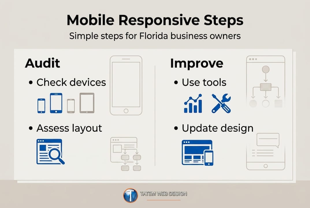
Step 4: Evaluate your platform. If your site runs on WordPress, Joomla, or another content management system, switching to a responsive theme may be a cost-effective solution. Many modern themes are responsive by default. If your site was custom-built years ago without responsive features, a redesign is likely necessary.
Here is a practical checklist to evaluate your mobile readiness:
- Text is readable without zooming on a 375px wide screen (standard iPhone width)
- All buttons and links are at least 44x44 pixels (the minimum recommended tap target size)
- No horizontal scrolling occurs on mobile screens
- Images load in under 3 seconds on a mobile connection
- Contact information (phone number, address, email) is clearly visible and tap-to-call enabled
- Navigation collapses into a clean mobile menu
- Forms are easy to fill out on a touchscreen keyboard
- No content is hidden or inaccessible on mobile
Pro Tip: For businesses like accountants, legal firms, and financial professionals, your website is often the first impression a potential client has of your practice. Reviewing accountant web design guidance tailored to your industry can help you understand the specific expectations your clients bring when visiting your site on mobile.
Step 5: Partner with a qualified web designer. Implementing responsive design correctly requires expertise. A professional who understands both the technical side and local Florida market conditions will deliver far better results than a generic template solution. Look for a partner who can show you examples of responsive sites they have built in your industry and who understands the specific devices and behaviors of your target customers.
Step 6: Maintain and monitor continuously. Responsive design is not a one-time fix. New devices emerge, browsers update, and your content changes over time. Set a quarterly reminder to check your site on the latest phones and tablets, review your mobile analytics, and address any new issues before they cost you customers. Ongoing adherence to web design best practices keeps your site performing at its best through every technology shift.
A fresh perspective: Why getting mobile responsive is the best investment for Florida businesses
Here is a perspective that most web design conversations skip entirely: the businesses we see struggle most with online growth in Florida are rarely the ones with the smallest budgets. They are the ones who spent their budget on flashy animations, elaborate custom illustrations, or expensive video backgrounds, while their core mobile experience remained broken. A visitor on a phone in a restaurant parking lot searching for a local plumber does not care about your animated logo. They care whether they can tap your phone number and call you right now.
Responsive web design adapts sites to every device, improving customer experience and engagement, and that foundational function outperforms every cosmetic upgrade you can buy.
We have worked with Florida businesses across healthcare, legal, real estate, and marine services for over 26 years, and the pattern is consistent. Companies that invest in solid responsive foundations first, and then layer on additional features, consistently outperform those who chase trends without addressing the basics. Your website’s job is to convert a curious visitor into a paying customer. A site that fails on mobile is not doing its job, regardless of how impressive it looks on your office desktop monitor.
The deeper insight here is about business user experience as a strategic asset. When your site works effortlessly on any device, you are not just improving a metric. You are building trust at the moment that trust matters most, the moment a potential customer is making a decision. That trust is the foundation of every sale that follows.
Invest in the foundation first. Everything else builds from there.
Take the next step: Mobile responsive solutions for Florida businesses
Your website should be your hardest-working salesperson, available 24 hours a day, seven days a week, on every device your customers use. If it is not fully responsive today, you are leaving real business on the table in one of the most competitive markets in the country.
At Tatem Web Design, we specialize in building professional web design solutions that are mobile-responsive from the ground up, powered by advanced AI tools to deliver fast, secure, and SEO-optimized results. Our AI website design process ensures your site looks and performs perfectly on every screen, from the latest iPhone to a laptop in your client’s office. Whether you need a full responsive redesign or a targeted audit of your current site, our website services are built to deliver measurable growth for Florida businesses. Call us directly at 772-224-8118 to schedule your consultation and see exactly how we can help your business perform better online starting today.
Frequently asked questions
What makes a website mobile responsive?
A mobile responsive website automatically adjusts its layout, content, and navigation to fit any screen size using flexible grids and media queries. Responsive design adapts websites for any device using fluid grids, images, and media queries, ensuring a consistent and usable experience regardless of screen dimensions.
Why is mobile responsiveness important for customer engagement?
Mobile responsiveness improves user experience and helps businesses keep customers on their site longer, leading to better engagement. Responsive design improves user experience by adapting to any device, which reduces frustration, lowers bounce rates, and creates more opportunities for visitors to take action.
How can Florida business owners tell if their website is responsive?
You can check responsiveness by viewing your site on different devices or using free online tools like Google’s Mobile-Friendly Test that evaluate layout adaptability. Pay attention to whether text is readable without zooming, buttons are tappable without difficulty, and no horizontal scrolling appears on your phone.
What tools or techniques are used to create a mobile responsive site?
Web designers use fluid grids, flexible images, and CSS media queries to make sites responsive to all device types. Responsive design uses fluid grids, flexible images, and media queries, and modern frameworks like Bootstrap or CSS Grid simplify implementation while ensuring consistent results across browsers and devices.
Recommended
Tatem Web Design
26+ YearsWeb Design & SEO Specialist · Tatem Web Design
Matt Tatem has been designing websites professionally since 1999, making Tatem Web Design one of Florida's longest-running web agencies. Based in Stuart, FL, he specializes in WordPress, local SEO, Shopify e-commerce, and cybersecurity consulting for small businesses.

CMMC Level 2 vs Level 1: Which One Applies to You?
CMMC Level 1 vs Level 2 compared: data types, 15 vs 110 requirements, self-assessment vs third-party audits, POA&M rules and how to pick your level.

Phishing Awareness Training for Small Business: A Practical Guide
How to build phishing awareness training for a small business: what to teach, how to run simulations, which numbers to track, and what to pair it with.

AI Content Pricing: What Florida Businesses Really Pay in 2026
What AI content costs in 2026: per-post ranges, tool subscriptions, editing time and agency retainers, plus how to budget and avoid hidden costs.