
UX Design’s Role in Conversion: A Business Owner’s Guide
The role of UX design in conversion is to shape how visitors interact with your website so they understand your value quickly and complete desired actions with confidence. Every $1 invested in UX returns an average of $100 in business value, a 9,900% ROI that no paid ad campaign can match. That number reflects a simple truth: design is not decoration. It is the mechanism that turns traffic into revenue. Business owners and digital marketers who treat UX as a core growth driver, rather than a visual afterthought, consistently outperform those who do not. This guide explains exactly how UX design influences conversion, with the data and strategies to act on it.
How does UX design reduce friction to increase conversions?
Friction is any point in your website experience where a visitor hesitates, gets confused, or gives up. Removing friction, building trust, and matching user expectations are the three primary ways UX improves conversion rates. Each friction point you eliminate moves visitors one step closer to completing a purchase, filling out a form, or booking a call.
The most common friction points on business websites include:
- Slow page load times. A one-second ecommerce page load delivers up to 2.5x higher conversions than a five-second load. Each extra second costs roughly 0.3 percentage points in conversion rate.
- Complex navigation. When visitors cannot find what they need in two clicks or fewer, they leave. Clear menu labels, logical page hierarchy, and a visible search function all reduce navigation friction.
- Confusing forms. Long forms with unclear field labels are a primary cause of checkout abandonment. Reducing form fields to only what is necessary, and labeling each field plainly, directly lifts completion rates.
- Unclear calls to action (CTAs). A CTA buried in body text or written in vague language (“Submit” instead of “Get My Free Quote”) forces visitors to interpret your intent. That cognitive work costs you conversions.
Fixing these issues produces measurable results. Checkout process design changes alone can increase conversion rates by 35%. That is not a marginal gain. For a business generating $50,000 per month in online revenue, a 35% lift means $17,500 in additional monthly revenue from a design change, not more ad spend.
The right approach to friction removal is systematic. Start by identifying where visitors drop off using heatmaps, session recordings, and funnel analytics. Tools like Google Analytics 4 show you exactly which pages lose the most visitors. Once you know where friction lives, fix the highest-impact points first.
Pro Tip: Audit your checkout or lead capture form first. It sits at the end of your funnel, meaning every improvement there captures visitors you have already paid to acquire.
Applying solid UX design principles to your navigation and page structure creates a compounding effect. Visitors who move through your site without confusion are far more likely to reach and complete your conversion goal.

In what ways does UX design build user trust that supports conversion?
Trust is a prerequisite for conversion. Visitors will not hand over their contact information, payment details, or time unless they believe your business is credible and your website is secure. UX design shapes that perception at every touchpoint.
The design elements that build trust most effectively include:
- Consistent branding. Fonts, colors, and tone that match across every page signal professionalism. Inconsistency signals carelessness, and carelessness signals risk.
- Transparent information. Pricing, policies, and contact details that are easy to find reduce anxiety. Hiding fees or burying your phone number creates suspicion.
- Social proof. Customer reviews, case studies, and client logos placed near decision points confirm that others have trusted you and benefited from it.
- Security badges. SSL certificates, payment security logos, and privacy policy links at checkout reduce hesitation at the moment it matters most.
The placement of trust signals matters as much as their presence. Trust signals delivered at critical decision moments, such as product pages and checkout, outperform homepage badges in both conversion and long-term retention. A security badge on your homepage is background noise. The same badge next to your “Buy Now” button is a conversion tool.
Poor UX drives 88% of users away permanently, and 70% of online businesses fail due to usability problems. Those numbers reflect the cost of broken trust. When a site feels disorganized or untrustworthy, visitors do not give second chances.
Service businesses, including law firms, healthcare providers, and financial advisors, rely on trust more than most. For these industries, UX design that communicates authority and transparency is not optional. It is the primary conversion mechanism. Platforms like ClickCoach demonstrate how service-based businesses use clean, trust-forward design to convert site visitors into paying clients.
Pro Tip: Do not stack every trust badge you can find on your homepage. Place the most relevant signal, a security badge, a review count, or a guarantee, directly beside the action you want visitors to take.
What are the key UX design strategies that boost sales and user engagement?
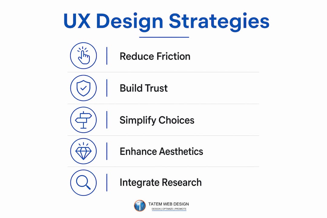
The most effective UX design strategies for sales share one quality: they reduce the mental effort required to make a decision. When visitors understand your offer instantly and see a clear path to getting it, conversion rates rise.
Clear value communication and information hierarchy
Your homepage and landing pages must answer three questions in under five seconds: What do you offer? Who is it for? What should I do next? Information hierarchy, the visual organization of content by importance, guides visitors to those answers without making them search. Use large, plain headlines for your core offer, supporting copy for context, and a single prominent CTA for the next step.
Simplified decision paths and onboarding flows
Every extra choice you present to a visitor reduces the likelihood they will choose anything. This is a well-documented cognitive principle called decision fatigue. Simplify your product or service pages to present one primary option with clear benefits, and reserve secondary options for visitors who actively seek them. For software and subscription businesses, a frictionless onboarding flow, one that gets users to their first “win” as fast as possible, directly improves both conversion and retention.
Balancing aesthetics with function
Visual appeal matters, but it must serve usability. A site that looks beautiful but buries its CTA below the fold or uses low-contrast text on a dark background will underperform a plainer site with clear layout and readable copy. The standard to aim for is WCAG 2.1 accessibility guidelines, which specify minimum contrast ratios and interactive element sizing. Meeting these standards improves usability for all visitors, not just those with accessibility needs.
Integrating UX research with CRO testing
UX research identifies the “why” behind user behavior; CRO testing validates fixes to improve conversions. Most businesses run A/B tests without first understanding why visitors are not converting. That approach produces random results. The correct sequence is: gather qualitative data (user interviews, session recordings, surveys), form a hypothesis about what is causing friction or confusion, then test a specific fix. This integrated approach produces sustainable conversion improvements and protects brand trust.
The table below shows documented conversion lifts from specific UX improvements:
| UX Improvement | Documented Conversion Impact |
|---|---|
| Checkout process redesign | Up to 35% increase in conversion rate |
| Page load time reduced to 1 second | Up to 2.5x higher conversions vs. 5-second load |
| 10% of budget allocated to UX | 83% increase in conversions |
| Well-designed UI vs. poorly designed | Up to 400% higher conversion rate |
These are not theoretical projections. They are documented outcomes from applying UX principles to real conversion funnels. For business owners focused on increasing ecommerce conversions, these figures represent the upper bound of what systematic UX investment can deliver.
How does UX design impact marketing efficiency and customer acquisition cost?
Marketing spend and UX quality are directly linked. When your website converts poorly, you must spend more on ads, SEO, and outreach to hit the same revenue target. Better design reduces customer acquisition cost by up to 50% by converting a higher percentage of the traffic you already have. That is not a UX benefit. That is a financial multiplier on every marketing dollar you spend.
The logic is straightforward. If your current site converts 2% of visitors and you spend $10,000 per month on paid traffic, you are paying for 98% of your visitors to leave without converting. Improving conversion to 4% through UX changes cuts your effective cost per acquisition in half, without changing your ad budget.
Design-led companies outperform peers with 32% higher revenue growth and 56% higher shareholder returns over five years. That performance gap reflects the compounding effect of UX across acquisition, retention, and lifetime value. Better UX lowers acquisition cost, increases retention, and raises average order value simultaneously.
The table below illustrates how conversion rate improvements affect customer acquisition cost at a fixed marketing spend:
| Monthly Ad Spend | Conversion Rate | Monthly Leads | Cost Per Lead |
|---|---|---|---|
| $10,000 | 1% | 100 | $100 |
| $10,000 | 2% | 200 | $50 |
| $10,000 | 4% | 400 | $25 |
| $10,000 | 8% | 800 | $12.50 |
Each doubling of conversion rate cuts cost per lead in half. No other marketing lever produces that result without increasing spend. For Florida businesses competing in high-cost local markets, real estate, healthcare, legal, and marine services, this math is the strongest argument for prioritizing UX investment.
Early UX investment also reduces post-launch rework costs by 50% and cuts support calls by one-third. Those savings compound over time, making UX one of the highest-return operational investments a business can make. Applying responsive web design best practices from the start, rather than retrofitting them later, is a direct example of this principle in action.
Key Takeaways
UX design directly drives conversion by removing friction, building trust, and reducing customer acquisition cost across every stage of the sales funnel.
| Point | Details |
|---|---|
| UX delivers exceptional ROI | Every $1 invested in UX returns an average of $100, a 9,900% return. |
| Friction removal lifts revenue | Checkout redesign alone can increase conversion rates by 35%. |
| Trust signals must be placed strategically | Place security badges and reviews at decision points, not just on the homepage. |
| UX cuts acquisition cost | Better design can reduce customer acquisition cost by up to 50% at the same ad spend. |
| Research plus testing wins | Combining UX research with CRO testing produces sustainable, compounding conversion gains. |
UX is the growth lever most businesses are still ignoring
After working with business owners across Florida for years, the pattern I see most often is this: a company spends thousands of dollars on Google Ads or SEO, drives real traffic to their site, and then wonders why leads are not coming in. The answer is almost always the website itself.
The conventional view treats UX as a design expense. The reality is that UX is a revenue mechanism. A well-designed site converts a higher percentage of every visitor you already have. That means your existing marketing budget works harder without spending a dollar more.
What surprises most business owners is how specific the fixes are. It is rarely a full redesign. It is a form that is three fields too long. It is a CTA button that blends into the background. It is a page that takes four seconds to load on a mobile connection. These are not aesthetic problems. They are conversion problems with measurable costs.
The other misconception I encounter is that UX research and A/B testing are separate disciplines for large companies with big teams. They are not. Even a small business can run a five-question user survey, watch three session recordings, and identify the one change that moves the needle most. The businesses that grow fastest are the ones that treat their website as a living system, not a one-time project.
My recommendation: audit your highest-traffic pages for friction first. Fix the path from landing to conversion before you spend another dollar on traffic. The return on that work will outpace almost any other investment you make this year.
— Matt
Tatemweb’s AI-powered UX design can lift your conversion rates
If your website is sending visitors away before they convert, the design is working against your marketing budget.
Tatemweb builds AI-powered websites engineered for conversion from the ground up. Every site includes performance-optimized page speed, clear navigation architecture, trust signal placement at key decision points, and AI-driven lead capture tools that engage visitors before they leave. For Florida businesses in real estate, healthcare, legal, and professional services, these are not add-ons. They are built into every project. Explore the full range of AI services for business or call Tatemweb directly at 772-224-8118 to discuss how better UX design can reduce your cost per lead and grow your revenue.
FAQ
What is the role of UX design in conversion?
UX design shapes how visitors interact with your website, removing friction and building trust so more of them complete a desired action. Well-designed interfaces can increase conversion rates by up to 400% compared to poorly designed ones.
How does page speed affect conversion rates?
Page speed is a direct UX factor. A one-second page load delivers up to 2.5x higher conversions than a five-second load, and each additional second costs approximately 0.3 percentage points in conversion rate.
How much should a business invest in UX design?
Allocating 10% of your budget to UX produces an average 83% increase in conversions. The return on UX investment averages $100 for every $1 spent, making it one of the highest-ROI business investments available.
Does UX design reduce marketing costs?
Yes. Better UX converts a higher percentage of existing traffic, which lowers cost per lead without increasing ad spend. Improved design can reduce customer acquisition cost by up to 50%.
What is the difference between UX research and CRO testing?
UX research uncovers why users behave a certain way on your site. CRO testing validates whether a specific design change improves conversion. Using both together produces more reliable and lasting results than either approach alone.
Recommended
Tatem Web Design
26+ YearsWeb Design & SEO Specialist · Tatem Web Design
Matt Tatem has been designing websites professionally since 1999, making Tatem Web Design one of Florida's longest-running web agencies. Based in Stuart, FL, he specializes in WordPress, local SEO, Shopify e-commerce, and cybersecurity consulting for small businesses.

Rank in ChatGPT in 90 Days With a Practitioner Led Checklist
Follow a practitioner led 90 day plan to get cited by ChatGPT: allow OAI-SearchBot, publish short answer capsules with schema, and track Bing AI Performance.

AI SEO Content Playbook: 16 GEO Signals for Agencies & Teams
A practical playbook mapping the GEO-16 signals to hands-on editorial workflows, review controls, and metrics. For agencies and in-house teams scaling AI...

Copy Ready Local Schema Markup for SMBs + Google Validation
Copy ready JSON-LD examples and Google validation steps for SMBs' local schema markup. Audit, implement, and verify each location page with confidence.