
How to Optimize Your Site for Mobile in 2026

Mobile site optimization is the process of adapting your website’s design, speed, and functionality to deliver a fast, usable experience on smartphones and tablets. Google’s mobile-first indexing became the default for all sites in july 2024, meaning Google now crawls and ranks your mobile version first. If your mobile site is slow, broken, or missing content, your search rankings suffer regardless of how polished your desktop site looks. For small and medium-sized business owners, knowing how to optimize site for mobile is no longer optional. It is the foundation of your online visibility.
What do you need before optimizing for mobile?
Before making any changes, you need a clear picture of where your site currently stands. Google PageSpeed Insights gives you a free performance score for both mobile and desktop, broken down by specific issues. Google’s Mobile-Friendly Test tells you whether Google can read your pages correctly on a phone. These two tools together give you a complete starting checklist before you touch a single line of code.
Testing on actual devices matters just as much as running automated tools. A score of 90 on PageSpeed Insights does not guarantee your menu works on a Samsung Galaxy or that your contact form submits correctly on an iPhone. Borrow a few phones from friends or colleagues and walk through your site manually. You will catch issues no automated tool flags.
Your site also needs a few technical prerequisites before mobile optimization makes sense:
- Responsive design framework: Your site must use a CSS framework that adjusts layout by screen size. WordPress themes built on frameworks like Bootstrap handle this automatically.
- Image compression tools: Tools like Squoosh or TinyPNG reduce file sizes before upload. Smaller images load faster on mobile connections.
- Google Search Console access: This free tool surfaces mobile usability errors directly from Google’s crawl data.
- Font size baseline: Set body text to a minimum of 16px. Anything smaller forces users to pinch and zoom, which Google counts as a usability failure.
- Tap target audit: Buttons and links must meet Google’s minimum size requirements before you address anything else.
Pro Tip: Run Google PageSpeed Insights on your three most visited pages, not just your homepage. Product pages and contact pages often have worse scores and more direct impact on conversions.
How to implement responsive design and ensure content parity
Responsive design is the industry standard for mobile compatibility because it serves the same URL and HTML to every device. The layout adjusts using CSS media queries, so a phone sees a single-column layout while a desktop sees three columns. This approach prevents the canonical and duplication issues that come with dynamic serving or separate mobile URLs like “m.yoursite.com.”

Dynamic serving and separate mobile URLs both create complexity. With dynamic serving, your server detects the device and sends different HTML to each. If that detection fails, mobile users get the desktop version. Separate mobile URLs require constant synchronization between two sites. One missed update means your mobile site shows outdated pricing, missing products, or broken links.
Content parity is the requirement that your mobile and desktop versions contain the same text, images, metadata, and structured data. Google’s mobile-first indexing means only the mobile version gets crawled for ranking purposes. If your desktop site has a detailed service description but your mobile site collapses it into two sentences, Google indexes the shorter version. That directly reduces your keyword coverage and ranking potential.
Follow these steps to audit and fix content parity:
- Compare page text: Open your site on a phone and on a desktop side by side. Read through each section. Any text hidden on mobile by a “show more” toggle that never loads in the HTML is invisible to Google.
- Check metadata: Use a browser extension or Google Search Console to confirm your mobile pages carry the same title tags and meta descriptions as desktop.
- Audit structured data: If your desktop pages use schema markup for reviews, products, or FAQs, your mobile pages must include the same markup.
- Verify internal links: Mobile layouts sometimes drop sidebar navigation or footer links. Confirm your mobile pages still link to your key service and product pages.
- Test image alt text: Images that load on desktop but get swapped for placeholders on mobile lose their alt text. Google cannot read images without alt text.
| Issue | Desktop | Mobile Risk |
|---|---|---|
| Hidden text in toggles | Visible | Not indexed by Google |
| Missing structured data | Present | Lost rich result eligibility |
| Dropped internal links | In sidebar | Reduced crawl coverage |
| Missing alt text | On images | Lost image search visibility |
For a deeper look at the full responsive design process, Tatemweb has published a step-by-step guide built specifically for Florida SMBs.
How do you improve mobile usability with tap targets and navigation?
Google mandates tap targets of at least 48x48 pixels with 8px spacing between them. Anything smaller triggers mobile usability errors in Google Search Console and can harm your rankings. A button that looks fine on desktop often shrinks to 20x20 pixels on a phone, making it nearly impossible to tap accurately without hitting the wrong element.
Font size is equally non-negotiable. Set your body text to at least 16px. Line height should sit at 1.5 to 1.6 times the font size, giving each line room to breathe. Small, cramped text forces users to zoom in, and Google treats that behavior as a usability signal against your site.
Navigation on mobile requires a different approach than desktop. Here are the core rules:
- Use a hamburger menu or bottom navigation bar: Hamburger menus are widely recognized on mobile. Bottom navigation bars work well for sites with five or fewer main sections, since thumbs reach the bottom of the screen more easily than the top.
- Keep menu items to seven or fewer: Long menus overwhelm mobile users. Group related pages under parent categories.
- Add click-to-call links: Your phone number should be a tappable link using the format
tel:+17722248118. A static phone number that users must copy and dial manually loses calls. - Add clickable mailto links: Email addresses should open the phone’s mail app directly when tapped.
- Avoid intrusive pop-ups: Google penalizes interstitials that cover mobile content. Use a small, dismissible banner at the top or bottom of the screen instead of a full-screen overlay.
- Test all interactive elements: Tap every button, link, and form field on an actual phone. Confirm each one responds correctly and leads where it should.
Pro Tip: Add a sticky “Call Now” button that stays visible as users scroll your mobile pages. This single element consistently increases inbound calls for service-based businesses without requiring a redesign.
Understanding mobile-friendly design at a deeper level helps you make better decisions about layout, navigation, and user flow before you build rather than after.
Why does mobile site speed matter so much?
Mobile visitors abandon sites that take more than three seconds to load. Three seconds sounds generous until you realize most mobile connections are slower than home Wi-Fi, and a single uncompressed hero image can push your load time past six seconds on its own. Speed is not a technical nicety. It is the first impression your site makes.
The most common cause of slow mobile sites is oversized images. Serving a 1,400-pixel-wide image to a phone with a 390-pixel screen wastes bandwidth and slows load times with no visual benefit. The fix is to convert images to WebP format, which delivers smaller file sizes at the same visual quality as JPEG or PNG. Then use the srcset attribute in your HTML to serve different image sizes based on screen width.
Follow these steps to improve your mobile load time:
- Convert images to WebP: Use Squoosh or your CMS’s built-in converter. WebP files are typically 25–35% smaller than equivalent JPEGs.
- Set image dimensions in HTML: Always specify width and height attributes on image tags. This prevents layout shift while the page loads, improving your Core Web Vitals score.
- Enable browser caching: Your hosting panel or a caching plugin stores static files locally on the user’s device after the first visit. Return visitors load your site almost instantly.
- Inline critical CSS: The CSS that controls your above-the-fold layout should load with the HTML, not from a separate file. This eliminates a round trip to the server before the page renders.
- Preload your hero image: Add a
<link rel="preload">tag for your main banner image. Preloading hero images reduces perceived load time and improves Core Web Vitals directly. - Remove unused plugins and scripts: Every plugin that loads JavaScript on your pages adds weight. Audit your plugins quarterly and remove anything you are not actively using.
- Use a content delivery network (CDN): A CDN stores copies of your site on servers around the world. Users load files from the server closest to them, cutting latency significantly.
Speed target: Aim for a fully interactive page in under three seconds on a 4G mobile connection. Google PageSpeed Insights shows your current time under “Time to Interactive” in the mobile report.
How do you optimize mobile forms and calls to action for conversions?
A contact form that works perfectly on desktop often fails completely on mobile. Small input fields, mismatched keyboards, and a submit button buried below the fold all kill conversions before the user even tries to fill out the form. Short mobile forms with limited fields have higher completion rates. Ask only for what you absolutely need: name, phone number, and one question about their need.
Input type selection is a detail most business owners miss entirely. When you set a phone number field to type="tel", the phone automatically shows the numeric keypad. When you set an email field to type="email", the keyboard shows the “@” symbol prominently. These small changes remove friction and reduce the chance a user gives up mid-form.
Here are the core rules for mobile forms and calls to action:
- Limit fields to three to five: Every additional field reduces completion rates. If you need more information, collect it after the initial contact.
- Enable autofill: Set the
autocompleteattribute on your form fields. Most phones will pre-fill name, email, and phone number automatically. - Make submit buttons large and obvious: The submit button must meet the 48x48 pixel minimum and use a contrasting color. Label it with a specific action like “Get My Free Quote” rather than the generic “Submit.”
- Place your primary call to action above the fold: Mobile users scroll less than desktop users. Your most important button or form should be visible without scrolling.
- Add a sticky call-to-action bar: A fixed bar at the bottom of the screen with a “Call Now” button keeps your primary conversion action accessible at all times.
The click-to-call gap is a real problem for small businesses. 93.2% of small business sites display a phone number, but only 63.5% make it clickable. That gap means more than a third of businesses are showing their number to mobile users who cannot tap it to call. Fixing this takes two minutes and directly increases inbound calls.
Pro Tip: Test your contact form on three different phones before launching any campaign that drives mobile traffic. A broken form on one device type can silently kill your lead generation for weeks.
Key Takeaways
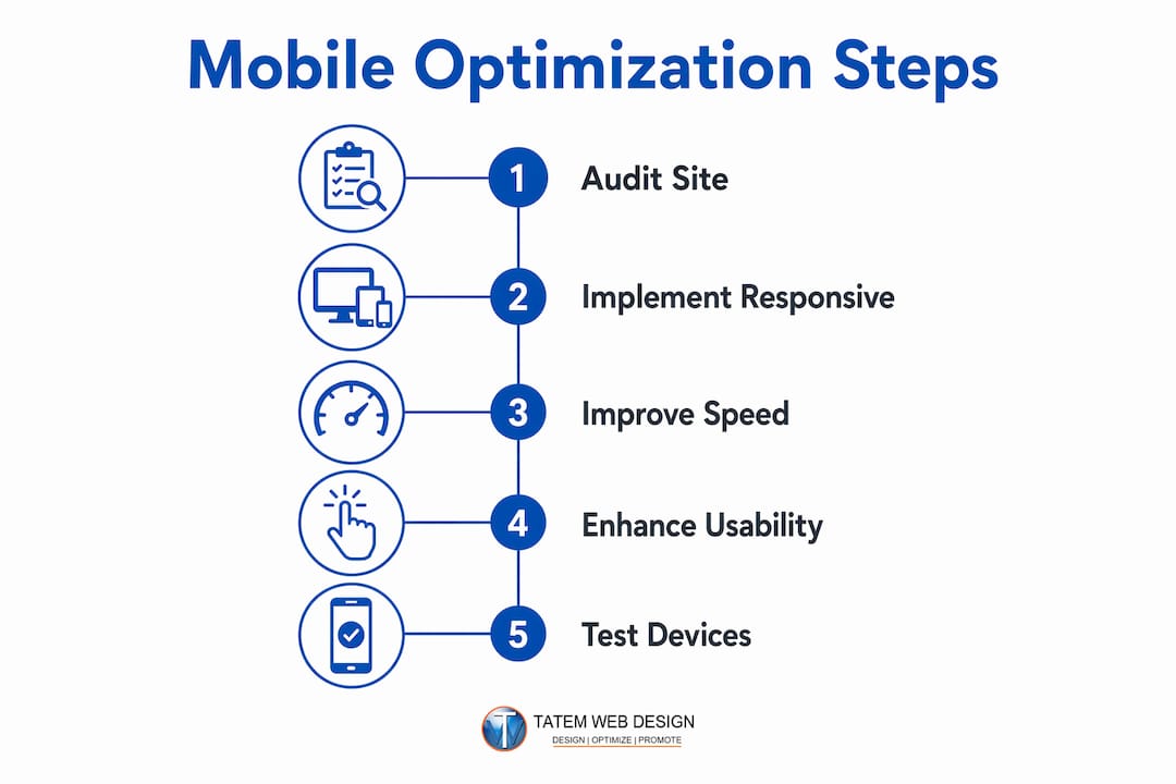
Mobile site optimization requires responsive design, content parity, fast load times, and tappable interfaces working together to meet Google’s 2026 mobile-first indexing standards.
| Point | Details |
|---|---|
| Responsive design is non-negotiable | Use a single URL and HTML for all devices to avoid canonical issues and ranking risk. |
| Content parity protects rankings | Your mobile version must match desktop text, metadata, and structured data exactly. |
| Tap targets must meet 48x48 pixels | Smaller buttons trigger Google Search Console errors and can lower your rankings. |
| Speed under three seconds is the target | Compress images to WebP, enable caching, and preload hero images to hit this benchmark. |
| Click-to-call links close the conversion gap | Make every phone number tappable to capture calls from the majority of your mobile visitors. |
What I’ve learned from fixing mobile sites for real businesses
The most common mistake I see business owners make is assuming mobile optimization requires a full website rebuild. It almost never does. The majority of mobile problems come from three fixable issues: images that are too large, phone numbers that are not clickable, and buttons that are too small to tap accurately. Fixing those three things alone moves the needle more than most expensive redesigns.
The second mistake is skipping manual testing. Automated tools are useful, but they do not catch everything. I have seen sites score 85 on PageSpeed Insights while having a contact form that simply does not submit on iOS Safari. The only way to catch that is to pick up a phone and try it yourself. Walk through your site as a customer would. Try to call you. Try to fill out your form. Try to find your address. You will find problems you never knew existed.
The third mistake is treating mobile optimization as a one-time project. Google updates its mobile usability criteria. Your site gets new plugins, new images, and new pages over time. A site that passed a mobile audit in 2024 may have new issues by 2026. Build a habit of running PageSpeed Insights and the Mobile-Friendly Test on your key pages every quarter. The essential website features that matter in 2026 are not the same list from three years ago.
Quick wins that cost nothing and take under an hour: wrap every phone number in a tel: link, increase your body font to 16px if it is smaller, and compress your homepage hero image with Squoosh. Those three changes will improve your mobile experience immediately, and you will see the difference in Google Search Console within a few weeks.
— Matt
Tatemweb builds mobile sites that perform from day one
If working through tap targets, image compression, and content parity audits sounds like more than you want to handle alone, that is exactly what Tatemweb is built for. With over 26 years of experience serving Florida businesses, Tatemweb builds AI-powered mobile websites that are fast, Google-compliant, and designed to convert mobile visitors into paying customers from the moment they launch.

Tatemweb handles responsive design, Core Web Vitals, mobile SEO, and conversion-focused layouts for businesses across real estate, healthcare, legal, marine, and professional services. You get a site built to Google’s 2026 mobile-first standards without spending months figuring it out yourself. Call Tatemweb directly at 772-224-8118 to schedule a mobile optimization audit and find out exactly what your site needs to perform at its best.
FAQ
What is mobile-first indexing and why does it matter?
Mobile-first indexing means Google uses your mobile site as the primary version for crawling and ranking. If your mobile site has less content or slower speed than your desktop version, your rankings drop.
How do I make my website mobile-friendly fast?
Start with three quick fixes: convert images to WebP, set body font to at least 16px, and wrap all phone numbers in clickable tel: links. These changes require no redesign and improve mobile usability immediately.
What size should buttons be on a mobile website?
Google requires tap targets to be at least 48x48 pixels with 8px spacing between them. Smaller buttons trigger usability errors in Google Search Console and can reduce your search rankings.
Does a slow mobile site hurt my Google ranking?
Yes. Google uses Core Web Vitals, which include load speed, as ranking signals. Sites that take more than three seconds to load on mobile connections lose visitors and rank lower in mobile search results.
What is the difference between responsive design and a separate mobile site?
Responsive design serves the same URL and HTML to all devices, adjusting layout with CSS. A separate mobile site uses a different URL and requires constant synchronization. Google favors responsive design because it eliminates canonical and duplication risks.
Recommended
Tatem Web Design
26+ YearsWeb Design & SEO Specialist · Tatem Web Design
Matt Tatem has been designing websites professionally since 1999, making Tatem Web Design one of Florida's longest-running web agencies. Based in Stuart, FL, he specializes in WordPress, local SEO, Shopify e-commerce, and cybersecurity consulting for small businesses.

Rank in ChatGPT in 90 Days With a Practitioner Led Checklist
Follow a practitioner led 90 day plan to get cited by ChatGPT: allow OAI-SearchBot, publish short answer capsules with schema, and track Bing AI Performance.

AI SEO Content Playbook: 16 GEO Signals for Agencies & Teams
A practical playbook mapping the GEO-16 signals to hands-on editorial workflows, review controls, and metrics. For agencies and in-house teams scaling AI...

Copy Ready Local Schema Markup for SMBs + Google Validation
Copy ready JSON-LD examples and Google validation steps for SMBs' local schema markup. Audit, implement, and verify each location page with confidence.