Website Design That Actually Grows Your Business

Your website is either working for you or costing you customers. For small to medium-sized businesses, effective website design goes far beyond picking colors and fonts. It determines whether visitors trust you enough to call, buy, or fill out a form. The businesses that understand this treat their website as a strategic asset, not a one-time project. This guide walks you through the principles, performance standards, accessibility requirements, and maintenance habits that separate a website that looks nice from one that consistently generates results.
Table of Contents
- Key takeaways
- The fundamentals of effective website design
- Core Web Vitals and website performance in 2026
- Making your website accessible for every visitor
- Responsive design best practices that actually work
- Treating your website as an ongoing system
- My honest take on why SMBs struggle with website design
- How Tatemweb helps SMBs build websites that perform
- FAQ
Key takeaways
| Point | Details |
|---|---|
| Design for business goals | Align every design decision with measurable outcomes like conversions and user engagement, not just aesthetics. |
| Performance directly affects revenue | Sites that pass Core Web Vitals standards see up to 30% better conversion rates and significantly lower bounce rates. |
| Accessibility is non-negotiable | Building for WCAG 2.2 compliance from the start protects you legally and expands your reachable audience. |
| Mobile-first is the default | Over 60% of web traffic is mobile, and Google indexes your mobile site first, making responsive design critical. |
| Websites need ongoing attention | A design system and regular performance reviews keep your site effective long after the initial launch. |
The fundamentals of effective website design
Most businesses approach a new website the same way they approach a logo: they want it to look great and reflect the brand. That instinct is not wrong, but it is incomplete. The visual layer is only one dimension of web design that drives results. The deeper question is whether your design moves visitors toward a specific action.
Start by getting ruthlessly clear on what you want your website to do. A law firm wants phone calls. A contractor wants quote requests. An e-commerce store wants completed purchases. Every design decision, from your navigation structure to your button placement, should serve that goal. Focusing on flashy mocks without KPI alignment is the most common and costly mistake businesses make when investing in a new site.
Here is what effective foundational design actually looks like in practice:
- Clarity above all. Your homepage should communicate what you do, who you serve, and what to do next within the first five seconds. If a visitor has to dig to understand your offer, they will leave.
- Defined user journeys. Map out the two or three paths a visitor is most likely to take, such as browsing services, reading reviews, and contacting you. Design those paths deliberately so each step naturally leads to the next.
- Consistent branding and UI elements. Your fonts, colors, button styles, and spacing should be identical across every page. Inconsistency signals carelessness and erodes trust faster than a slow load time.
- White space is a feature. Crowding content together to show more information usually results in visitors absorbing less. Give each element room to breathe.
- Call-to-action placement matters. Put your primary CTA above the fold on every major page. Repeat it at the bottom. Do not make visitors scroll and hunt for a way to contact you.
Pro Tip: Before your design team starts on visuals, write down three measurable goals for the site, such as “increase contact form submissions by 20% in 90 days.” Share those goals as the project brief. Every design decision should trace back to one of them.
Branding consistency also matters more than most owners realize. When a potential customer visits your Facebook page, then your website, then your Google Business profile, they should feel like they are interacting with the same company. Professional photography plays into this too. Corporate headshots and brand imagery used consistently across your site and profiles reinforce credibility in a way that stock photos simply cannot.

Core Web Vitals and website performance in 2026
Google does not just read your content. It measures your experience. Core Web Vitals are the three technical metrics Google uses to assess how a real person actually feels when using your website. In 2026, these metrics carry direct weight in search rankings, and failing them means you are likely losing organic traffic to competitors who have optimized.
Here is what each metric measures:
| Metric | What it measures | Good threshold |
|---|---|---|
| LCP (Largest Contentful Paint) | How fast the main content loads | Under 2.5 seconds |
| INP (Interaction to Next Paint) | How quickly the page responds to clicks or taps | Under 200 milliseconds |
| CLS (Cumulative Layout Shift) | How much the page layout jumps around during load | Under 0.1 |
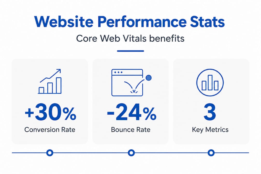
Sites passing Core Web Vitals thresholds see 15 to 30% better conversion rates and 24% lower bounce rates. That is not a minor performance footnote. That is revenue. On the flip side, a 1-second delay in page load reduces conversions by up to 7%, which compounds quickly when you are running any kind of paid advertising.
One of the most common performance mistakes on SMB sites involves the hero image. Many web developers apply lazy-loading to all images by default, including the hero at the top of the page. That is the opposite of what you want. Lazy-loading your LCP element like a hero image harms your LCP score because the browser delays fetching it. Your hero image should be excluded from lazy-loading and given high fetch priority in your code.
Pro Tip: Run your site through Google’s PageSpeed Insights tool and look specifically at your LCP element. If it is your hero image and it is being lazy-loaded, fix that one issue first. It often produces the biggest single improvement in performance score.
Other practical steps to improve performance include compressing all images before uploading, auditing your WordPress or CMS plugins and removing anything unused, choosing a lightweight theme rather than a feature-heavy page builder, and hosting on a fast, reliable server. Most SMB sites fail mobile Core Web Vitals specifically because of plugin bloat and theme overhead accumulated over time. Regular maintenance is not optional if you want to stay competitive. For a deeper look at how performance connects to revenue, the Tatemweb team has covered website speed and revenue impact in detail.
Making your website accessible for every visitor
Accessibility is the area where most small businesses are unknowingly exposed. WCAG 2.2 is the current standard for web accessibility, and it covers far more than just text size or adding alt tags to images. Getting this wrong is not just a missed opportunity. It is a potential legal liability.
Here is where many businesses fall short specifically:
- Color contrast for text. Normal-sized text needs a minimum 4.5:1 contrast ratio against its background. Large text needs 3:1. Many popular website color palettes fail this test.
- Non-text contrast. This is where most designers misunderstand WCAG 2.2. Buttons, input fields, icons, and other UI components also need a 3:1 contrast ratio. A light gray button outline on a white background almost always fails.
- Focus indicators. When a keyboard user tabs through your site, there must be a visible highlight around the currently selected element. Focus indicators must remain visible and have sufficient contrast, or keyboard-only users cannot navigate your site at all.
- Form labels. Every form field needs a visible, descriptive label. Placeholder text does not count as a label once a user starts typing.
- Alternative text for images. Descriptive alt text helps screen reader users and also gives search engines more context about your images.
The business case for accessibility goes beyond compliance. Approximately 300 million people worldwide are affected by color blindness alone. Add in users with low vision, motor impairments, or situational disabilities like trying to read a phone screen in bright sunlight, and you are talking about a substantial portion of your potential customers.
The most important strategic point here is timing. Integrating accessibility during initial design is significantly more efficient than retrofitting it later. Retrofitting accessibility into an existing site is expensive, time-consuming, and often incomplete. Build it in from the start and treat it like any other functional requirement.
Free tools like WebAIM’s Contrast Checker let you test color combinations before committing to a palette. Browser extensions like Axe DevTools can audit an existing page for accessibility issues in minutes. These are small investments of time that prevent much larger problems down the road.
Responsive design best practices that actually work
Over 60% of web traffic is now mobile, and Google indexes your mobile site first when determining your search rankings. If your website was designed for desktop and mobile was an afterthought, you have an alignment problem that affects both user experience and SEO simultaneously.
Responsive website design means your layout adjusts fluidly based on the screen size viewing it, rather than having a separate mobile version or a desktop layout that simply shrinks. Here is a practical approach to getting this right:
- Design for mobile first. Start your design process at 375 pixels wide, which is a common phone size, and expand from there. This forces you to prioritize the most important content and actions upfront.
- Use flexible grid layouts. CSS Grid and Flexbox let elements reflow naturally rather than having fixed pixel widths that break on smaller screens. This is a technical requirement your developer should handle by default.
- Make all images scalable. Images should have a maximum width of 100% so they never overflow their container. Use modern formats like WebP to keep file sizes small without sacrificing quality.
- Design for touch. Buttons and tap targets should be at least 44 by 44 pixels so users can tap them without frustration. Navigation menus need to be thumb-friendly, not just functional.
- Test on real devices. Browser dev tools give you an approximation, but actual testing on a range of phones and tablets reveals real usability issues that simulators miss. Pay particular attention to form completion and checkout flows.
- Check load times on mobile connections. A page that loads in 2 seconds on WiFi may take 6 seconds on a standard mobile connection. Test under throttled conditions to understand the experience your actual users have.
The Tatemweb team has documented specific responsive web design best practices worth reviewing if you are planning a new build or a redesign.
Treating your website as an ongoing system
Here is the mindset shift that separates businesses with high-performing websites from those with expensive digital brochures: a website is never finished. It is a system that requires consistent attention, measurement, and refinement.
The practical foundation for this is a design system. A design system is a documented set of components, styles, and guidelines that define how every element of your site looks and behaves. Think of it as the rulebook for your brand online.
- Documented style guides define your exact colors, fonts, spacing, and button styles so that any update made by any team member or vendor maintains consistency.
- Reusable components in your CMS mean that adding a new service page or team member bio does not require a developer. Design systems empower non-technical staff to update content while maintaining style integrity across the site.
- Planned performance reviews every quarter catch issues before they accumulate. Plugin updates, image audits, and Core Web Vitals checks should be on a calendar, not triggered only when something breaks.
- Accessibility audits should happen at least annually, or any time you make significant design changes.
- Analytics integration closes the loop. Google Analytics 4 and tools like Microsoft Clarity show you exactly where users drop off, which pages convert, and where the friction is. That data should drive your next round of improvements.
A well-documented design system prevents fragmentation over time, enables scalable updates, and means your site gets more effective as the years pass rather than degrading into a collection of inconsistent pages. For user experience design to remain effective, it must be treated as a discipline, not a deliverable.
My honest take on why SMBs struggle with website design
I have worked with hundreds of small to medium-sized business owners on website projects, and the pattern is almost always the same. The owner has a strong vision of what they want the site to look like and very little clarity on what they need it to do. That gap is where most website investments go sideways.
The business owner approves a beautiful design, the agency builds it, and three months after launch everyone notices the phone is not ringing any more than it was before. The problem was not the design. It was the absence of a measurable strategy behind it.
What I have found actually works is approaching a website the way you would approach a sales hire. You would not hire a salesperson without a defined goal, a process to follow, and a way to measure their performance. Your website deserves the same clarity. Set specific targets before a single wireframe is drawn. Define what success looks like in numbers.
The other pattern I see constantly is businesses treating accessibility and performance as optional add-ons. They are not. Both affect your search rankings, your legal exposure, and the experience of real people trying to give you money. Every week you spend with an inaccessible or slow site is a week your competitors who have fixed those issues are capturing customers you should have reached.
My honest advice: stop planning for a redesign and start planning for a design system. Iterative, data-driven improvements to a solid foundation consistently outperform the big expensive redesign that resets your SEO and introduces new problems. Work with a team that tracks your KPIs, not just your approval of the mockup.
— Matt
How Tatemweb helps SMBs build websites that perform
If this guide has made one thing clear, it is that effective website design requires more than a good-looking layout. You need performance optimization, accessibility compliance, mobile responsiveness, and an ongoing strategy tied to measurable goals. That is exactly what Tatemweb delivers.
Tatemweb has been building websites for Florida businesses for over 26 years, and today the agency leads with AI-powered website design that combines professional strategy with the speed and precision of modern AI tools. Sites are built SEO-optimized, accessibility-ready, and performance-tuned from day one. Whether you need a service site, an AI-powered e-commerce store, or a full web development services package including digital marketing and cybersecurity compliance, Tatemweb has the expertise to match your goals to a solution that works. Call 772-224-8118 or visit tatemweb.com to schedule a consultation and see what your website should be doing for your business.
FAQ
What is the cost of website design for a small business?
Website design costs for small businesses typically range from $2,500 to $15,000 depending on complexity, number of pages, and whether e-commerce or custom features are included. AI-assisted design services like those offered by Tatemweb can reduce timelines and costs significantly while maintaining professional quality.
How long does it take to design a website?
A professionally designed small business website generally takes four to twelve weeks from kickoff to launch, depending on the scope and how quickly content and feedback are provided. AI-powered web development services can compress that timeline considerably.
What makes a website design responsive?
Responsive website design uses flexible grid layouts, scalable images, and CSS media queries so the layout adapts fluidly to any screen size, from desktop monitors down to mobile phones, without requiring a separate mobile site.
How often should I redesign my website?
Rather than a full redesign every few years, a better approach is continuous improvement guided by analytics. Major structural redesigns are typically warranted every four to five years, with performance, content, and accessibility updates happening on an ongoing basis throughout.
What is WCAG 2.2 and does my business website need to follow it?
WCAG 2.2 is the current Web Content Accessibility Guidelines standard that defines how websites must be built to be usable by people with disabilities. While legal requirements vary by business type, following WCAG 2.2 reduces legal risk and expands your audience to include the millions of users with visual, motor, or cognitive impairments.